Indiana To Wear New "Retro 'Candy Stripe'" Uniforms Against Nebraska
/Written By Sammy Jacobs (@Hoosier_Huddle)
Earlier on Wednesday morning Indiana Athletics and adidas unveiled the Hoosiers newest football uniform. Before we get into what the Hoosier Huddle staff thinks about the new digs, here is the release from Indiana University.
BLOOMINGTON, Ind. - Indiana University and adidas today unveiled the 'Candy Stripe' Primeknit alternate football uniform, which will be worn Saturday, October 15th for IU's Homecoming game vs. Nebraska at Memorial Stadium. The classic, yet innovative uniforms marry Indiana's classic brand and traditions to adidas' innovative designs and technology.
Inspired by the first candy stripe designs that Doc Counsilman and Hobie Billingsley used to better spot their legendary 1960's and 1970's swimming and diving teams at the pool, and later adopted by the 1971-72 basketball team, the retro look was designed in concert between Indiana Athletics and adidas Football to encapsulate the history and significance of the design that ushered in a historic era and created iconic identity for the university.
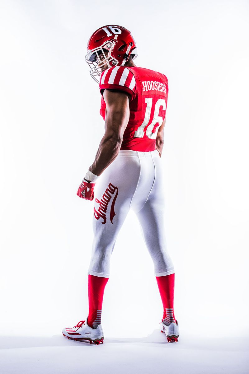
Combining innovation with style and detailing, the special edition uniform is centered around the iconic crimson and white colors of the Hoosiers' athletic programs. Starting with a crimson jersey, the sleeves are highlighted with candy stripes that pay homage to the aesthetic featured on the Hoosier basketball team's warm-ups. Next, an oversized 'Script Indiana' logo, made popular by being on the back of the basketball warm-up shirts, is highlighted in crimson on the leg of the white pants and offset with crimson socks and white cleats to create a head-to-toe candy stripe theme.
The historic inspiration continues with white classic tackle twill numbers, highlighted with hints of the Indiana state flag. Each number has its own unique piece of the flag, depicting different angles of the 19 stars and torch that represent liberty and enlightenment of the 19th state to join the United States. Additionally, six stars releasing rays of light that embody the state's far-reaching influence are depicted within the design. Topping off the theme on the jersey, the interlocking IU emblem sits directly above the chest plate to amplify Hoosier pride.
Merging historical significance with innovative technology, the special edition retro look is made with Primeknit, a proprietary yarn blend that increases durability and abrasion resistance. Primeknit is the premier compression uniform system, featuring the latest generation of adidas TECHFIT technology, that helps keep players cool and increases range of motion, giving athletes an unrivaled level of comfort and allowing them to perform at their highest levels. The jersey's padlock system secures tension over the shoulder pads, while the bodymap fit adheres to the player, making it difficult for opponents to grab, hold or tackle.
As a tribute to the traditional aesthetic of the Hoosiers football program, a crimson helmet features white player numbers containing hints of the Indiana state flag to match the numbers on the jersey. Additionally, the state flag is incorporated into the TECHFIT baselayer with a torch, stars and oversized Indiana script graphic logo. Finally, the adizero 5-Star 5.0 gloves feature the Indiana script logo atop a crimson carbon fiber pattern. The adizero 5-Star 5.0 gloves feature 4-way stretch mesh for compression fit and GripTack for consistent control in all weather conditions.
So what do the Hoosier Huddle writers think?
Sammy Jacobs
When I first saw the tweet this morning about the new candy stripe uniforms,my mind immediately said "Oh no, we are going to look like the Steelers, but it crimson and cream". However, after seeing the pictures, I love them. My biggest fear would be having too much candy stripe. I love how IU minimizes it and uses it as a nod to the tradition of the design and the history behind it. It flows well and is topped with a great looking helmet, which finally matches the font of the numbers on the jersey. The white pants with the script 'Indiana' is a sharp look as well.
Alex Compton
Finally. A jersey that not only maintains the traditional look of our football team, but also brings traditional IU elements that everyone is familiar with on to the gridiron. I was personally terrified of a complete candy striping of the pants or helmets, so the small area on the sleeves really hits home with me. I would have loved to see some sort of matte crimson helmet with a white IU logo, but I can save that for another day. There is excitement surrounding the program now, and it is good to see there are things being done to capitalize on that excitement.
Cam Koenig
I'm glad that the pants aren't candy stripes, that's for sure. The state flag in the numbers is a nice touch. I am not a huge fan of the candy striped shoulders though. The script Indiana on the pants is nice. Overall I like them though. It's a nice little change of pace.
TJ Inman
When I initially read about IU unveiling "Candy Stripe Football Uniforms", I groaned a bit and was worried they had followed through on mimicking the iconic warm-ups of the basketball team. Don't get me wrong, I love those warm-up pants with the red shooting jacket and the "Script Indiana" on the back, it's a classic look that I would never want to see changed. I had seen the mock-ups of what a football uniform would look like if the design mimicked that look and the results were not pretty. So, I went to iuhoosiers.com and pulled up the photo gallery with the pictures of the new uniforms and I was quite relieved that the uniforms are simply a nod to the candy stripes. In short, I think these look great. I absolutely love the crimson socks and the white pants with the red "Script Indiana" vertically placed on the pants leg. I think the jersey looks great as well. The chest is clean with only an IU logo centered right above large numbers. The nod to the candy stripes comes on the shoulders/arms of the jersey and it's clear what they are paying homage to but they didn't go "over the top". My only minor nitpick is that I wish the helmets had a logo instead of numbers but that's just my personal preference.
I think having one-off, special uniforms for one game every season is a great idea and a way to generate a bit of extra buzz around the program and, in this case, around the Homecoming game. Anything more than that (like Oregon, who seems to release a flashy Adobe presentation explaining their newest uniforms every darn week) and you are getting into gimmicky territory but I think this was well done by Adidas and IU athletics and I hope to see something like it in seasons to come.


